Healthcare And Insurance Overview Card
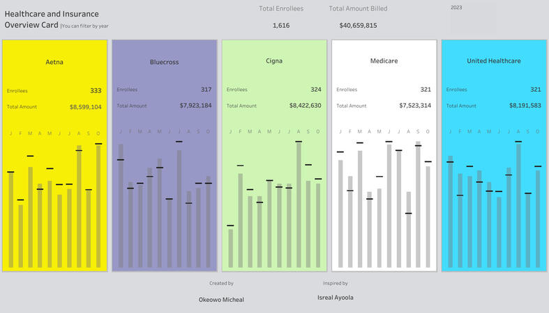
Inspired by a dashboard I saw on LinkedIn, I decided to try my hand at creating a visual overview of healthcare data.Using a dataset with over 10,000 rows of information, I built an interactive dashboard that highlights:
Top insurance providers
Total billing amounts
Monthly billing and patient trends (filterable by year)
Checkout the dashboard hereThis project was a great way to practice my data visualization skills and learn how to turn raw data into actionable insights.Let me know if you'd like any more variations!
Malaria Hotspots: Africa's Highest Case Burdens
Project objective
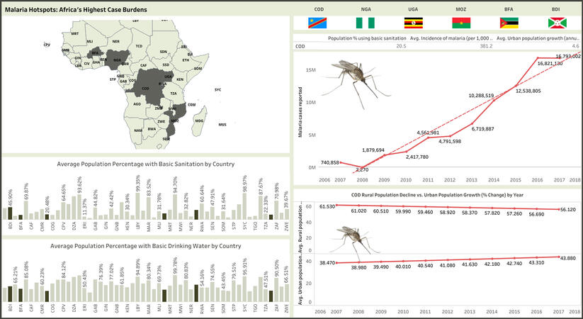
The objective of this project was to identify the countries with the highest malaria cases reported over the 10-year period (2007-2017) and explore common factors contributing to the high incidence rates. This analysis aimed to provide insights that could inform targeted interventions to reduce malaria prevalence in African countries.
High Malaria Burden: The top 6 countries with the highest malaria cases reported were Congo Dem Republic, Nigeria, Uganda, Mozambique, Burkina Faso, and Burundi.
Population Dynamics: All six countries experienced a yearly drop in rural population and a corresponding increase in urban population.
Urbanization and Malaria: The increase in urban population and malaria cases reported suggests a possible relationship between urbanization and malaria incidence. Rapid urbanization can lead to overcrowding, inadequate sanitation, and increased breeding grounds for disease vectors such as mosquitoes, contributing to the spread of malaria in urban areas.
Sanitation Access: Despite efforts, the average population with access to basic sanitation in each country remained below 50% over the decade.
Malaria Incidence Increase: There was a significant increase in malaria cases for each country over the 10-year period. The percentage difference between the number of malaria cases reported in 2007 and the final one for each country in 2017 is as follows:
Congo Dem Republic: 2154%
Nigeria: 719%
Uganda: 1011%
Mozambique: 6890%
Burkina Faso: 23121%
Burundi: 206%
Dataset Source: The dataset used for this analysis was downloaded from Kaggle.Access the dataset hereConclusion:The analysis highlights the complex relationship between population dynamics, access to sanitation, urbanization, and malaria incidence. The significant increase in malaria cases underscores the urgent need for targeted interventions to address sanitation issues, particularly in rural areas. Improving access to basic sanitation services can play a critical role in reducing malaria prevalence and improving overall public health outcomes in these countries.Recommendations:1. Infrastructure Development: Governments and stakeholders should prioritize infrastructure development to improve access to basic sanitation services, especially in rural areas.2. Health Education: Intensify public health campaigns to educate communities about the importance of sanitation in preventing malaria and other diseases.3. Urban Planning: Urban planning should consider malaria control measures to mitigate the impact of urbanization on malaria transmission.4. Collaborative Efforts: Enhance collaboration between governments, NGOs, and international organizations to implement effective malaria control programs and improve sanitation infrastructure.This project showcases my ability to analyze complex datasets, identify meaningful patterns, and draw actionable insights. It demonstrates my commitment to using data-driven approaches to address real-world challenges and make a positive impact on public health.
The IPL Chronicles: A Visual Journey into Team Success and Player Triumphs
About This Project: Diving Headfirst into the IPL
During my internship with The Sparks Foundation, I got to do something really cool – dig deep into data from the Indian Premier League (IPL). Cricket's always been a passion of mine, and this project let me combine that with my growing love for data analysis. The result? An interactive dashboard that tells the story of the IPL in a whole new way.
The Challenge: Beyond the Scorecard
My mission was to go beyond the obvious wins and losses. I wanted to find out what really makes teams successful, who the standout players are, and what factors – even something as simple as winning the coin toss – might influence the game. This wasn't just about number crunching, it was about finding the hidden patterns that could help teams and brands make smarter decisions.
What I Found: The IPL Uncovered
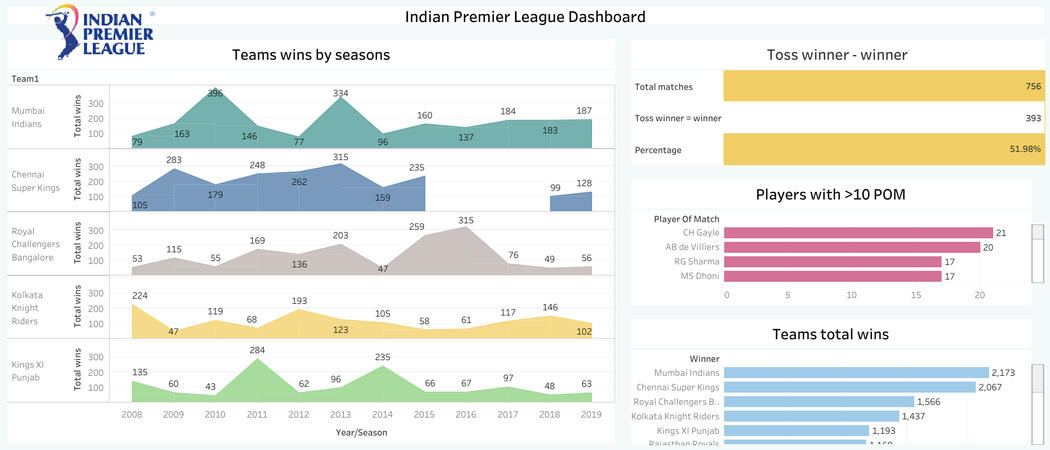
Dominant Duos: Mumbai Indians and Chennai Super Kings are the undisputed kings of the IPL. They've racked up over 2,000 wins each – a feat no other team comes close to.
Star Players: Guys like Chris Gayle, AB de Villiers, and MS Dhoni aren't just fan favorites, they're the ones consistently named 'Player of the Match.' They're the game-changers.
The Toss Factor: Believe it or not, winning the toss seems to give teams a slight edge, leading to victory about 52% of the time.
Turning Data into Action
All this data led to some pretty cool insights:
Dream Team Endorsements: If I were a company looking for a team to rep my brand, Mumbai Indians or Chennai Super Kings would be at the top of my list. They're consistent winners and fan favorites.
Player Power: Players like YK Pathan, SR Watson, and Suresh Raina could be awesome brand ambassadors. Their performance on the field translates to real influence.
Check It Out For Yourself
I've put all my findings into an interactive dashboard on my Tableau page. Click here to explore – you might be surprised at what the data reveals!
Bottom Line: It's Not Just a Game, It's a Strategy
This project wasn't just a fun way to spend my internship. It showed me how powerful data can be when it comes to understanding something as complex and exciting as the IPL. By digging into the numbers, we can uncover insights that could actually change the way teams play and brands connect with fans.
Fitbit Data analysis with R
In this exploratory data analysis, I set out to unveil the trends in fitness device usage among 30 Fitbit users. Using R, I delved into a dataset encompassing daily activity, sleep patterns, hourly metrics, and even weight fluctuations.This project involved a multi-step process, starting with cleaning, sorting, and joining the various datasets to create a comprehensive view. Then, I dove into analysis, using R's powerful tools to uncover patterns and correlations.
Here are some of the steps I took:
Prep Work: Equipped myself with R packages like tidyverse and ggplot2.
Data Cleanup: Loaded daily activity data, removed duplicates, and converted dates to the correct format using mdy().
New Calculations: Created a column (Total_D1) to double-check total distance calculations. Added a logged column to identify if activities were tracked properly.
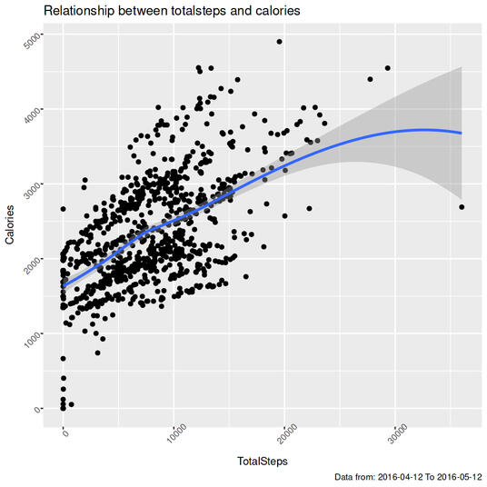
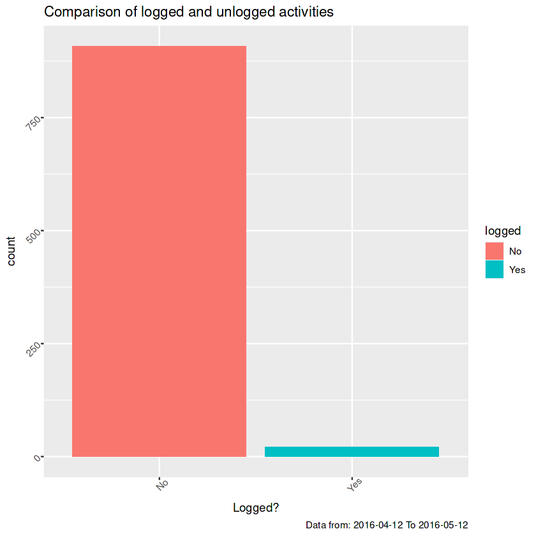
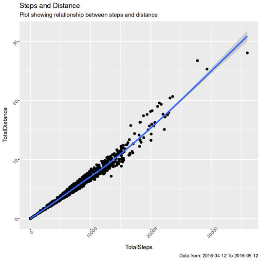
Visual Exploration:Scatter plots (geompoint(), geomsmooth()) revealed relationships between steps, distance, and calories. A bar chart showed the frequency of logged vs. unlogged activities.
More Data: Integrated weight (weightLogInfomerged.csv) and sleep (sleepDaymerged.csv) data, performing similar cleaning and checks.
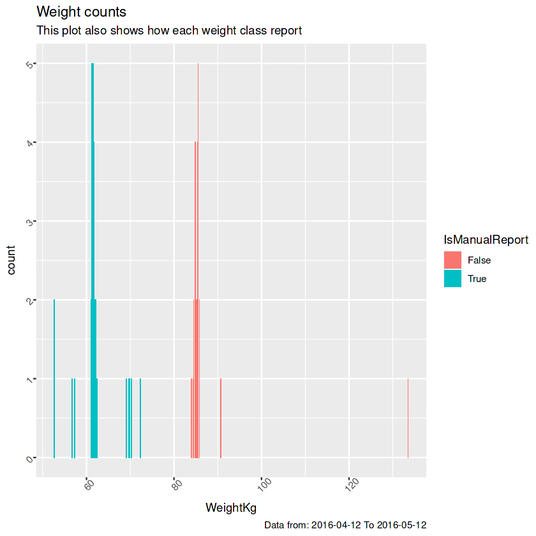
Weight & Sleep: Used bar charts to examine weight distribution and a scatter plot to visualize sleep patterns (TotalTimeInBed vs. TimeNotAsleep).
Hourly Analysis: Loaded and merged hourly data on steps, intensity, and calories.
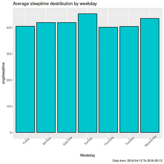
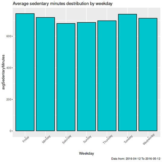
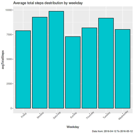
Weekly Trends: Calculated and plotted average daily values (sleep, sedentary minutes, total steps) for each weekday using group_by() and summarise().
The Big Picture: This analysis unveiled interesting patterns in steps, calories, sleep, and weight across the 30 Fitbit users. It was a great way to practice my data skills and see how personal health data can reveal fascinating insights.
The R code detailing this process is below, showcasing the specific functions and techniques I employed to gain insights into how these users interact with their Fitbit devices.
#Setting the work space environment#installing and loading all necessary packages for the analysis, including data set files{r loading packages}##Assigning operator###Reading the dailyactivitymerged file and assigning and operator for easy use later
install.packages("tidyverse")
library("tidyverse")
install.packages("ggplot2")
library("ggplot2")
install.packages("janitor")
library("janitor")
install.packages("dplyr")
library("dplyr")
library(lubridate)
{r reading daily_activity}##Viewing the dailyactivity table###Viewing the dailyactivity table to have a glimpse of what we're working with.
daily_activity <- read.csv("dailyActivity_merged.csv")
{r viewing daily_activity}##Removing duplicates and arranging by Id
head(daily_activity)
{r}##Changing date format
daily_activity <- unique(daily_activity)
daily_activity %>%
arrange("Id")
head(daily_activity)
{r}##Changing column name
daily_activity$ActivityDate <- mdy(daily_activity$ActivityDate)
class(daily_activity$ActivityDate)
print(daily_activity)
{r}##Create new columns###Creating a new column Total_D1 to confirm the totaldistance , select total distance and TotalD1 to see both columns side by side
names(daily_activity)[names(daily_activity) == "ActivityDate"] <- "Date"
print(daily_activity)
{r mutate Total_d1}###Creating a new yes or no column in da2 to show the activities distance that got logged and ones that did not get logged , this is to be used for a bar char later
daily_activity<- daily_activity %>%
mutate(Total_D1=(VeryActiveDistance + ModeratelyActiveDistance + LightActiveDistance + SedentaryActiveDistance))
head(daily_activity)
daily_activity %>%
select(TotalDistance, Total_D1)
{r logged activty distance ?}##Calculations###Calculating the minimum and maximum dates of data in the table
daily_activity$logged <- cut(daily_activity$LoggedActivitiesDistance,
breaks=c(-1,0,1,2,3,4), labels=c('No', 'No', 'Yes', 'Yes', 'Yes'))
{r mindat & maxdate}###Counting number of rows in totaldistance that tally with Total_D1, and rows that do not tally
mindate <- min(daily_activity$Date)
maxdate <- max(daily_activity$Date)
{r}sum(daily_activity$TotalDistance !=daily_activity$Total_D1)
sum(daily_activity$TotalDistance==daily_activity$Total_D1)
###Counting the number of rows where activities distance is not logged. UnloggedActivityDistance (ulad), loggedActivityDistance(lad){r unlogged and logged activity distance}#Plots ##totalsteps and totaldistance scattered plot with line
Unlogged_activity_distance <- nrow(daily_activity[daily_activity$LoggedActivitiesDistance == 0, ])
Logged_activity_distance <- (940-908)
{r totalsteps , totaldistance}##Totalsteps and calories scattered plot with line
ggplot(daily_activity, aes(x=TotalSteps, y= TotalDistance))+
geom_point()+
geom_smooth()+
labs(title="Steps and Distance", subtitle="Plot showing relationship between steps and distance", caption= paste0("Data from: ",mindate, " To ",maxdate))+
theme(axis.text.y = element_text(angle=45),
axis.text.x = element_text(angle=45))
{r}##LoggedActivities bar plot###Creating a bar plot to visualized the yes and no column created earlier.
ggplot(daily_activity, aes(x=TotalSteps, y= Calories))+
geom_point()+
geom_smooth()+
labs(title="Relationship between tottalsteps and calories", caption = paste0("Data from: ",mindate," To ", maxdate))+
theme(axis.text.y = element_text(angle=45),
axis.text.x = element_text(angle=45))
{r LoggedActivities}##Reading weight log info and SleepDay csv files, assigning an operator and using head to check the first 6 rows of the datasets
ggplot(data=subset(daily_activity, !is.na(logged)), aes(x=logged, fill= logged))+
geom_bar()+
theme(axis.text.x = element_text(angle= 45),
axis.text.y = element_text(angle=45))+
labs(title="Comparison of logged and unlogged activities", caption= paste0("Data from: ",mindate, " To ",maxdate),
x= "Logged?")
{r weightLogInfo}##Changing sleepday format to Date only and also creating a weekday column
weight <- read.csv("weightLogInfo_merged.csv")
sleep <- read.csv("sleepDay_merged.csv")
head(sleep)
{r}##Changing sleepday calumn name to Date
sleep$SleepDay <- as.Date(mdy_hms(sleep$SleepDay))
print(sleep)
{r}##Creating weekday column
names(sleep)[names(sleep) == "SleepDay"] <- "Date"
print(sleep)
{r}# removing dupliates and arranging by Id
sleep <- sleep %>%
mutate(Weekday = weekdays(Date))
print(sleep)
{r}## Counting the number of occurrences for each unique Id
sleep <- unique(sleep)
sleep <- sleep %>%
arrange("Id")
print(sleep)
{r count Id }##Checking the number of occurrences for each Totalsleeptime
weight %>%
count(Id)
{r SleepDay}##Missing value
sleep %>%
count(TotalSleepRecords)
{r}##Creating a new column in sleepday (sd) for TimeNotAsleeep
num_of_rows_with_zero_sleep <- sum(sleep$TotalMinutesAsleep == 0)
{r}## Missing values
sleep <- sleep %>%
mutate(TimeNotAsleep=(TotalTimeInBed - TotalMinutesAsleep))
head(sleep)
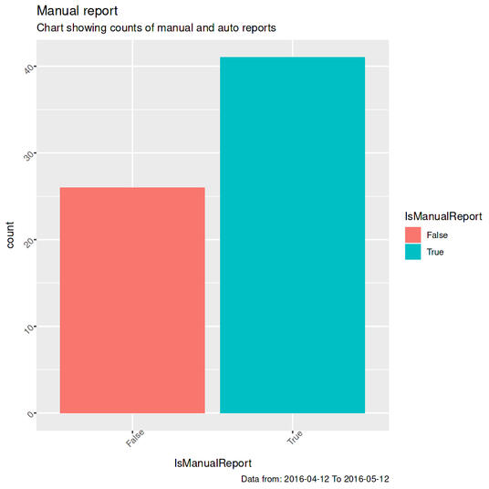
{r}##Plotting a bar chart for manual reports to show the counts of manual reports compared to auto
no_of_rows_with_zero_sleep <- sum(sleep$TotalMinutesAsleep == 0)
{r}## calculating mnweight and maxweight
ggplot(weight, aes(x=IsManualReport, fill= IsManualReport))+
geom_bar()+
theme(axis.text.x = element_text(angle=45),
axis.text.y = element_text(angle=45))+
labs(title="Manual report", subtitle="Chart showing counts of manual and auto reports",caption= paste0("Data from: ",mindate," To ", maxdate))
{r}##Plotting a bar chart showing weight counts and also categorizing how each weight class report , manual or not .
minweight <- min(weight$WeightKg)
maxweight <- max(weight$WeightKg)
minweight
maxweight
{r}##Scattered plot to show relationship between TimeAsleep and TimeNotAsleep
ggplot(weight, aes(x=WeightKg, fill= IsManualReport))+
geom_bar()+
theme(axis.text.x = element_text(angle=45),
axis.text.y = element_text(angle=45))+
labs(title="Weight counts ", subtitle="This plot also shows how each weight class report", caption = paste0("Data from: ",mindate," To ", maxdate))
{r}## Loading hourly datasets
ggplot(sleep, aes(y=TimeNotAsleep, x= TotalTimeInBed))+
geom_point()+
geom_smooth()+
labs(title="TimeAsleep and TimeNotAsleep scattered plot",
caption= paste0("Data from: ",mindate," To ", maxdate))+
theme(axis.text.x = element_text(angle=45))
{r}# Creating date and weekday column and changing dat format## Hourly steps
hourly_steps <- read.csv("hourlySteps_merged.csv")
hourly_intensities <- read.csv("hourlyIntensities_merged.csv")
hourly_calories <- read.csv("hourlyCalories_merged.csv")
{r}
 hourly_steps <- hourly_steps %>%
 mutate(
 ActivityHour = mdy_hms(ActivityHour, tz = "UTC"))
 print(hourly_steps)
{r}## Hourly intensities
hourly_steps <- hourly_steps %>%
mutate(Date = as.Date(ActivityHour),
Weekday = weekdays(ActivityHour))
head(hourly_steps)
{r}## Hourly calories
hourly_intensities <- hourly_intensities %>%
mutate(
ActivityHour = mdy_hms(ActivityHour, tz = "UTC"),
Date = as.Date(ActivityHour),
Weekday = weekdays(ActivityHour)
)
{r}# Joining dataframes## Daily data
hourly_calories <- hourly_calories %>%
mutate(
ActivityHour = mdy_hms(ActivityHour, tz = "UTC"),
Date = as.Date(ActivityHour),
Weekday = weekdays(ActivityHour))
{r}## Hourly data
daily <- inner_join(daily_activity, sleep, by = c("Id", "Date"))
{r}# Daily average time asleep
hourly_data <- hourly_steps %>%
left_join(hourly_intensities, by = c("Id", "ActivityHour", "Date", "Weekday")) %>%
left_join(hourly_calories, by = c("Id", "ActivityHour", "Date", "Weekday"))
print(hourly_data)
{r}# Average sleep time by weekday bar chart
daily_avg_sleeptime <- daily %>%
group_by(Weekday) %>%
arrange(Weekday) %>%
summarise(avgsleeptime = mean(TotalMinutesAsleep))
{r}# Daily average sedentary minutes
ggplot(daily_avg_sleeptime, aes(x = Weekday, y = avgsleeptime))+
geom_bar(stat="Identity", fill = "turquoise3", color = "black", alpha = 1)+
theme(axis.text.x = element_text(angle=45))+
labs(title="Average sleeptime destribution by weekday",
caption = paste0("Data from: ", mindate," To ", maxdate))
{r}# Average sedentary minutes bar chart
daily_avgSedentaryMinutes <- daily %>%
group_by(Weekday) %>%
summarise(avgSedentaryMinutes = mean(SedentaryMinutes))
head(daily_avgSedentaryMinutes)
{r}## Average totalsteps by weekday
ggplot(daily_avgSedentaryMinutes, aes(x = Weekday, y = avgSedentaryMinutes))+
geom_bar(stat= "Identity", fill = "turquoise3", color ="black", alpha= 1)+
theme(axis.text.x = element_text(angle=45))+
labs(title="Average dedentary minutes destribution by weekday",
caption = paste0("Data from: ", mindate," To ", maxdate))
{r}## Average total steps by weekday bar chart
avg_daily_total_steps <- daily %>%
group_by(Weekday) %>%
summarise(avg_daily_total_steps = mean(TotalSteps))
print(avg_daily_total_steps)
{r}
 ggplot(avg_daily_total_steps, aes(x = Weekday, y = avg_daily_total_steps))+
 geom_bar(stat = "Identity", fill="turquoise3", color="black", alpha = 5)+
 theme(axis.text.x = element_text(angle=45))+
 labs(title = "Average total steps destibutiion by weekday", caption = paste0("Data from: ", mindate," To ", maxdate))
